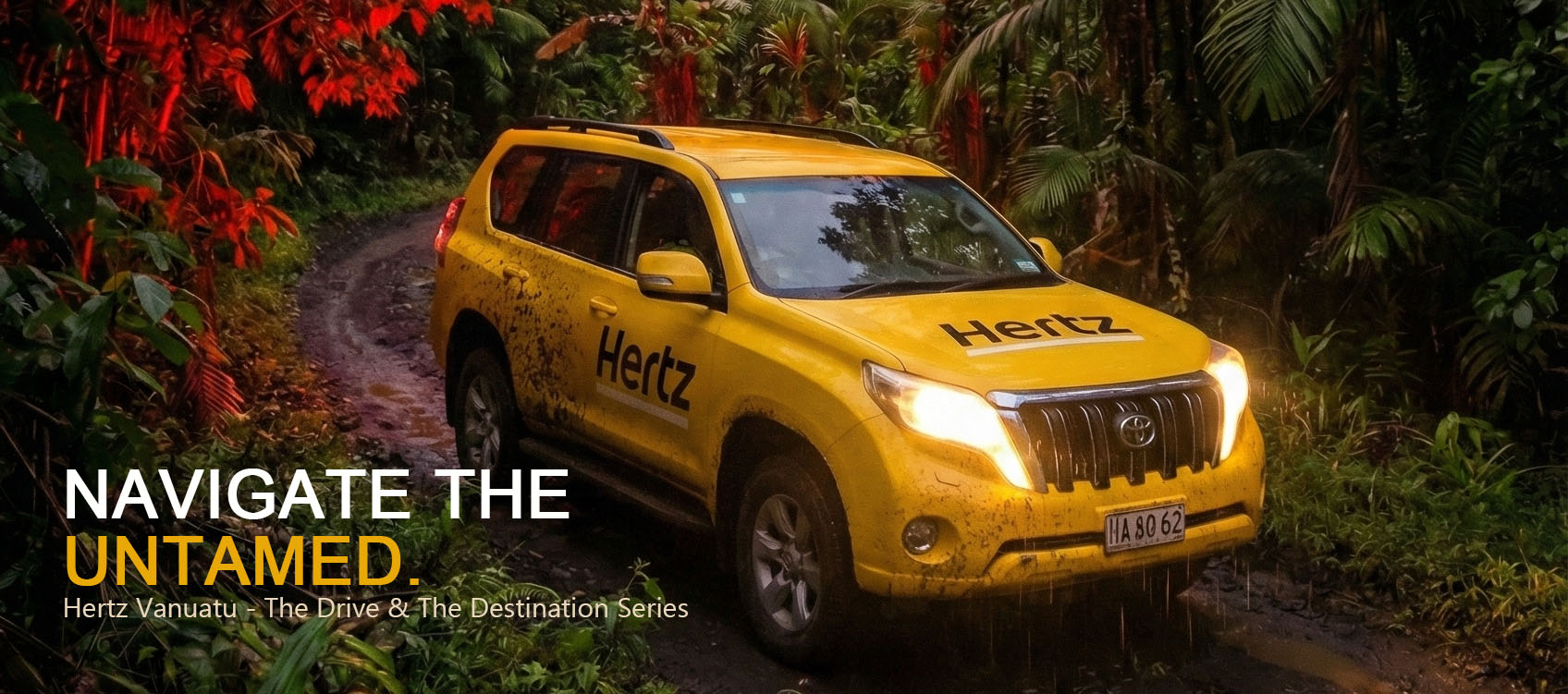
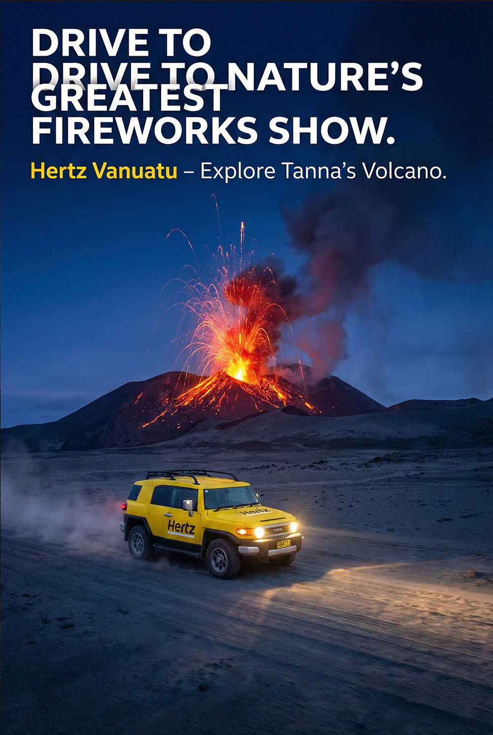
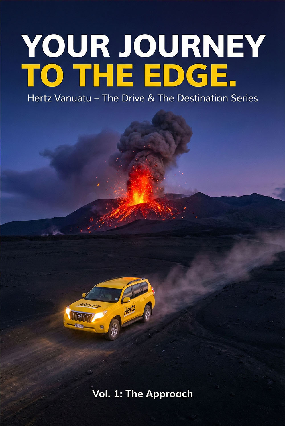
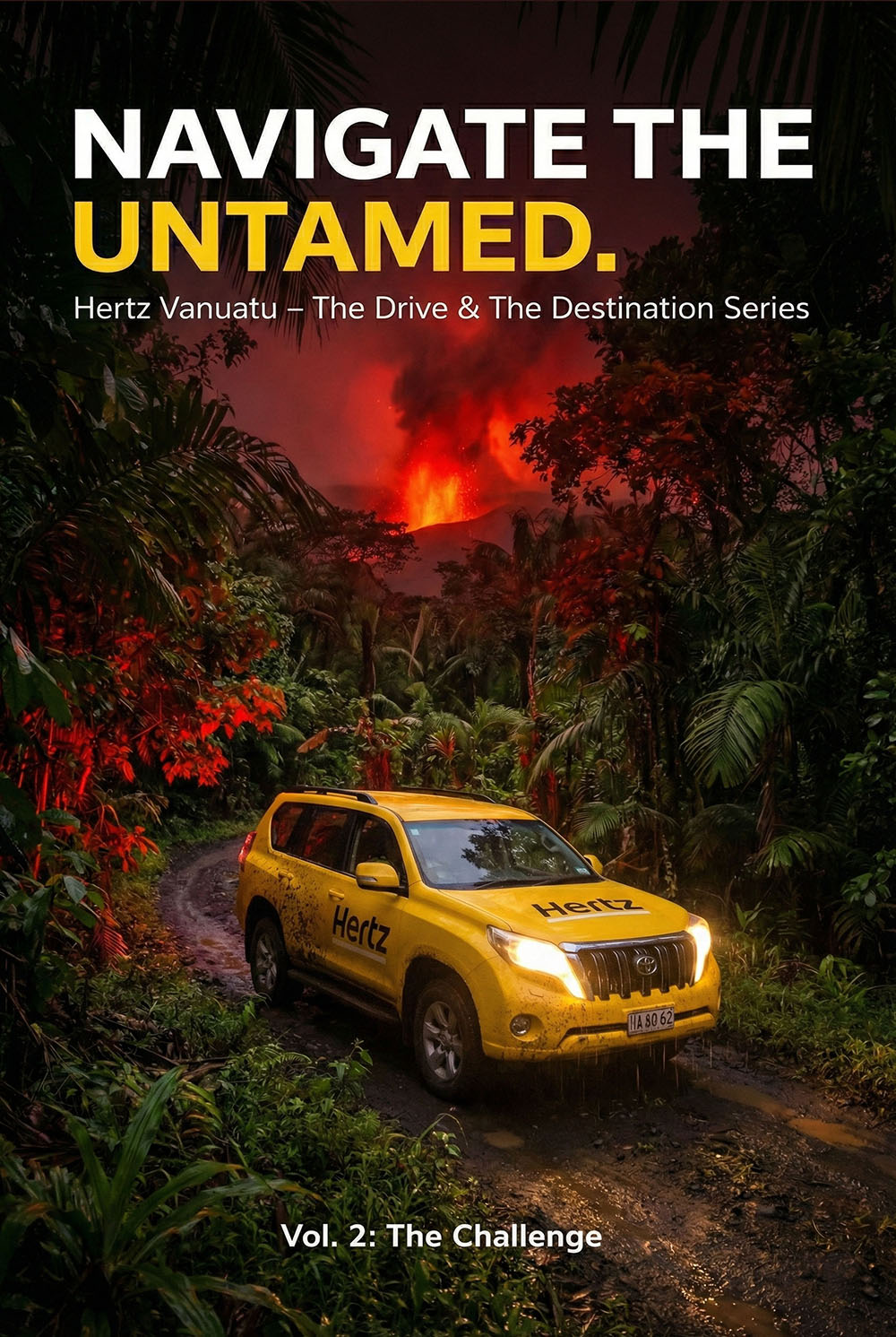
We are not selling a vehicle; we are selling the confidence to explore
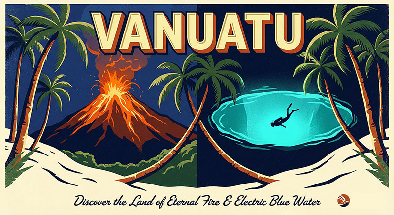
Visual Tension Concept: Utilizing extreme contrast. The high-saturation Hertz Yellow cuts through the dark volcanic blues and reds, creating an immediate visual hook.
Cinematic Narrative Concept: Rejecting static product shots. We structured the campaign as a "Hero’s Journey" trilogy (The Approach → The Challenge → The Reward).
Brand Symbolism Concept: Positioning the car as a "Safe Zone." In the untamed nature of Tanna, Hertz becomes the symbol of civilization and reliability.
THE STUDIO VANNA EDGE "At STUDIO VANNA, we turn a rental car into a hero vehicle."
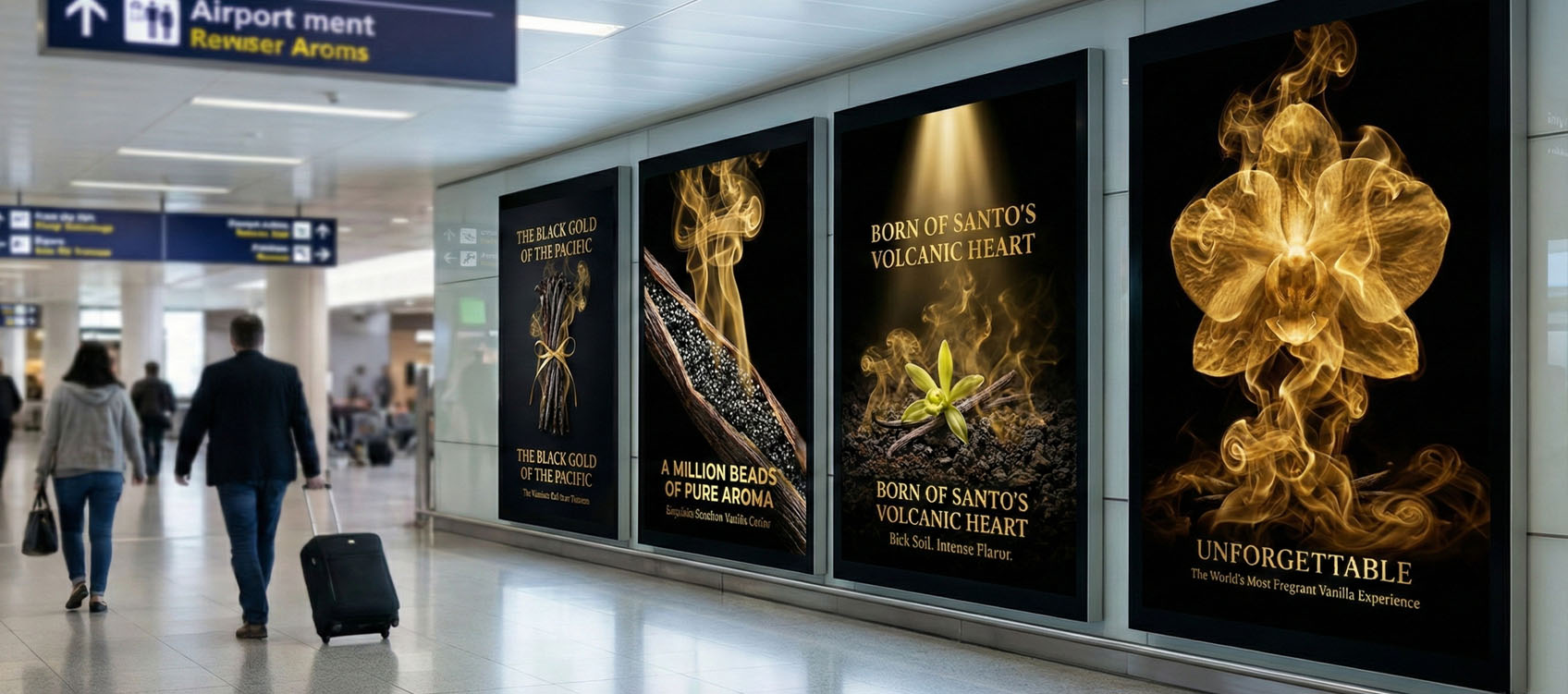
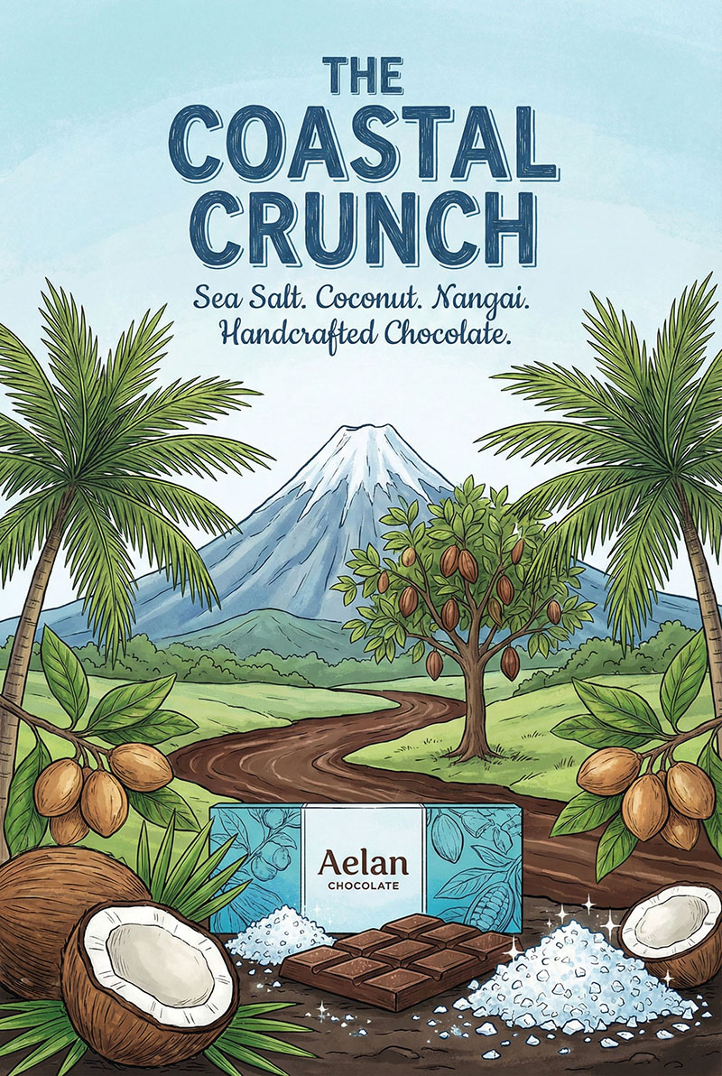
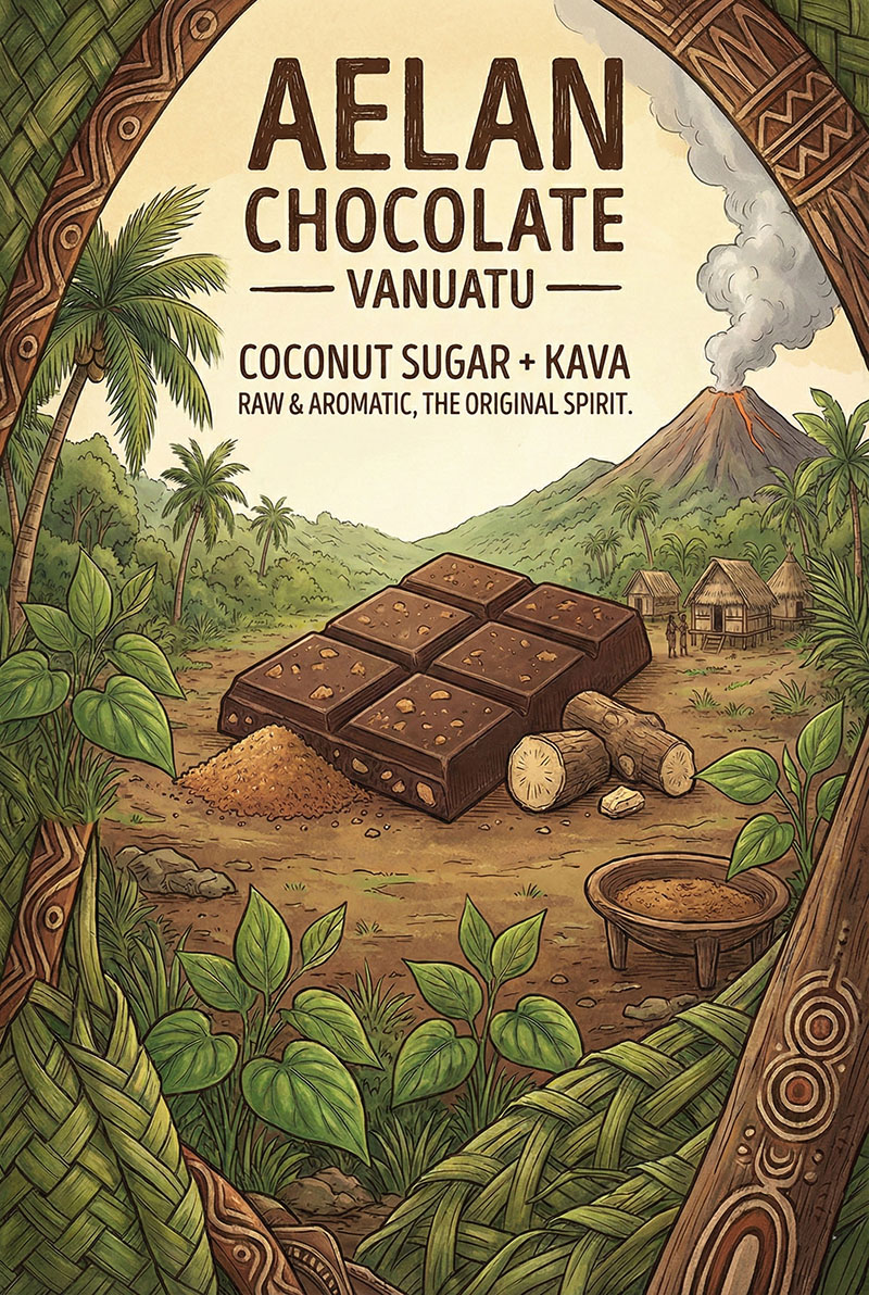
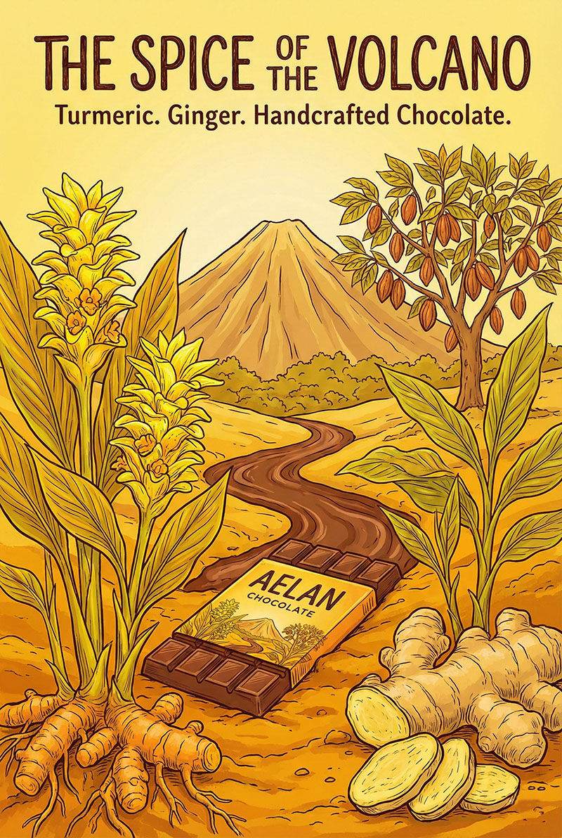
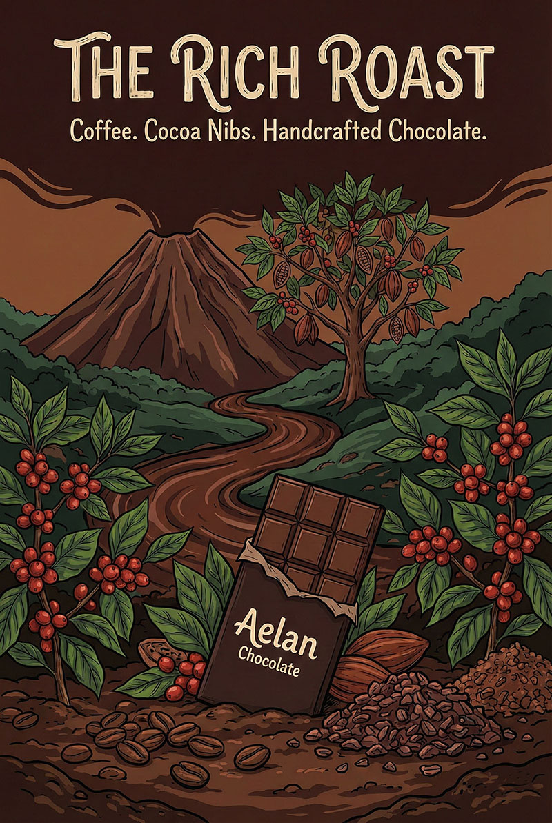
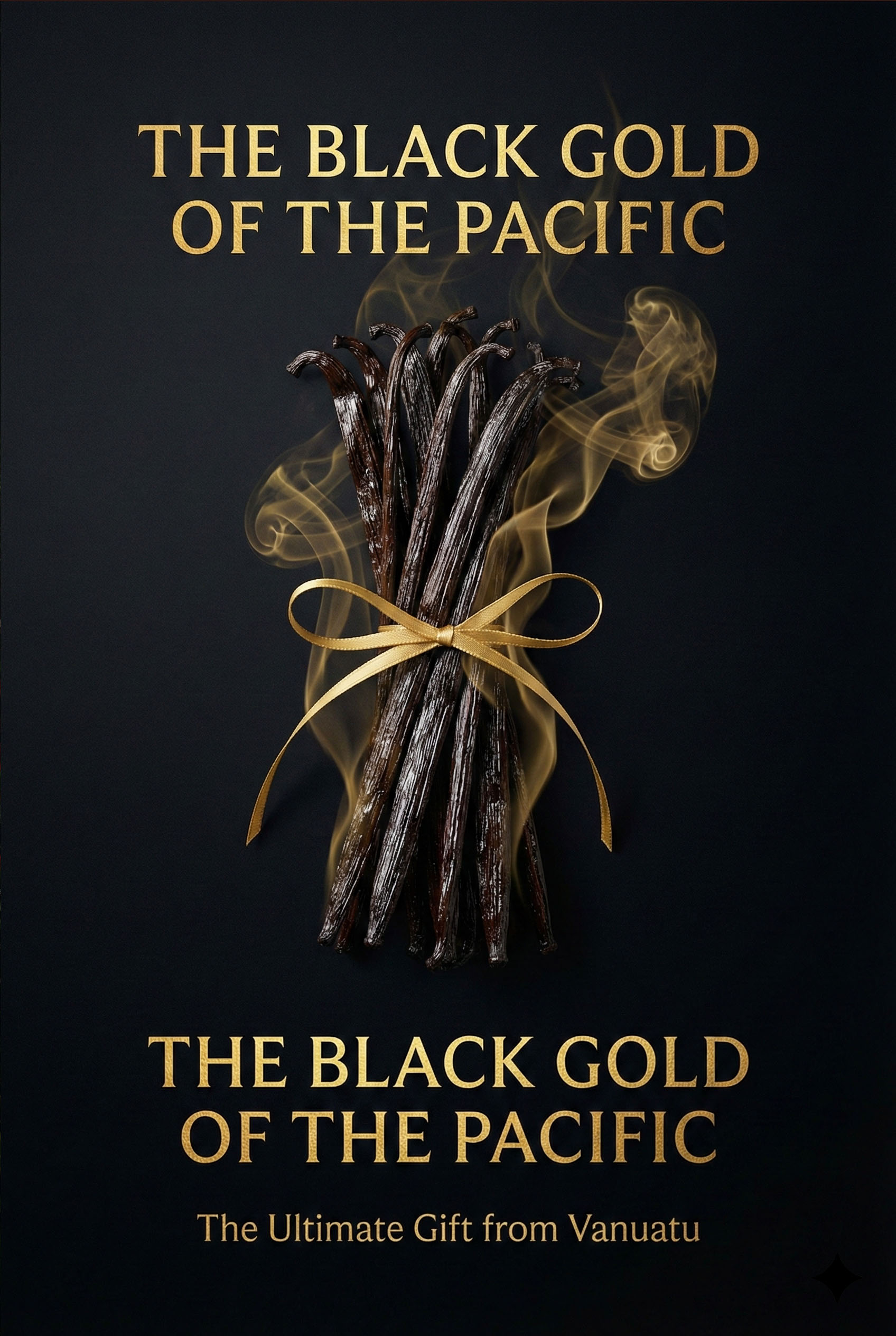
We are not selling a sweet treat; we are selling the intense flavor of the land.
Origin Storytelling Concept: Leveraging Vanuatu's unique geography. We visually connected the active volcanoes with the richness of the cocoa beans, positioning the product not just as "Made in Vanuatu," but "Forged by Fire."
Sensory Contrast Concept: Visualizing texture. We juxtaposed the silky, melting texture of premium chocolate against the rough, porous surface of volcanic rocks. This tactile contrast triggers immediate appetite and curiosity.
Premium Aesthetics Concept: Dark Mode Luxury. A palette dominated by Deep Cocoa Brown and Charcoal Black, accented with Metallic Gold typography, elevates a local souvenir to the status of international fine dining.
THE STUDIO VANNA EDGE:"At STUDIO VANNA, we elevate local produce to world-class luxury."
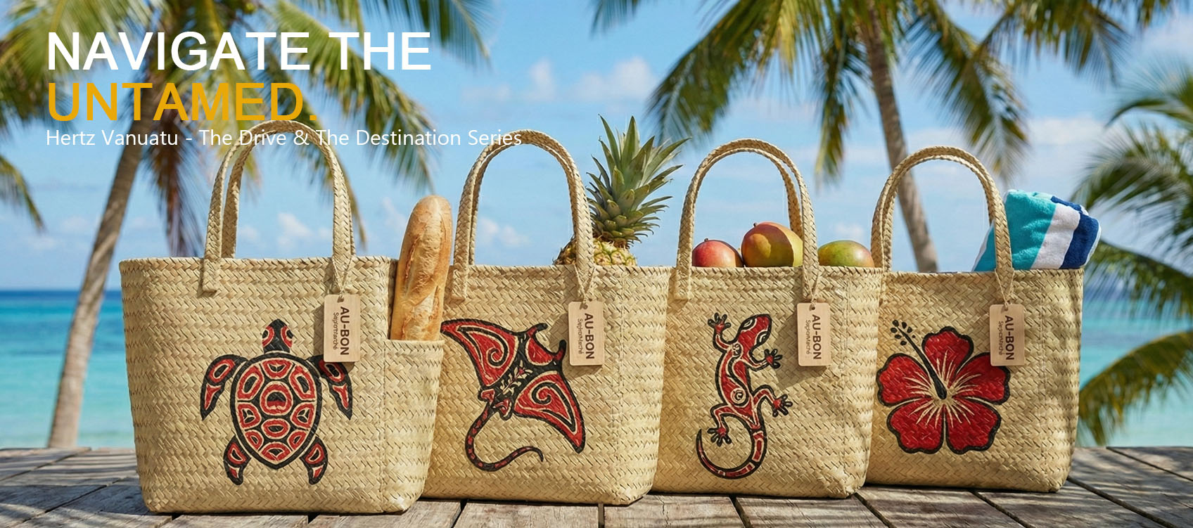
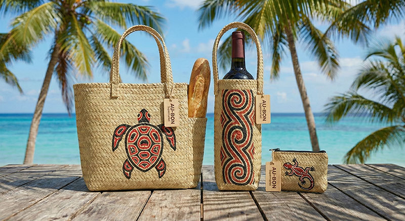
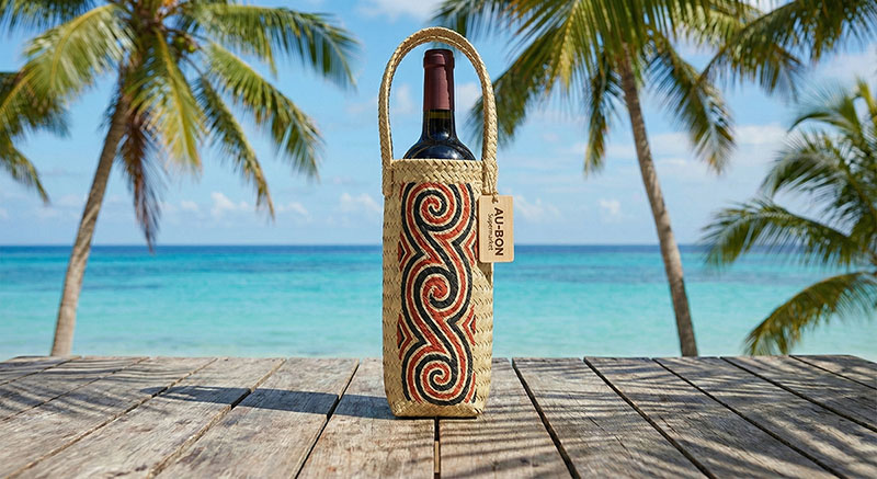
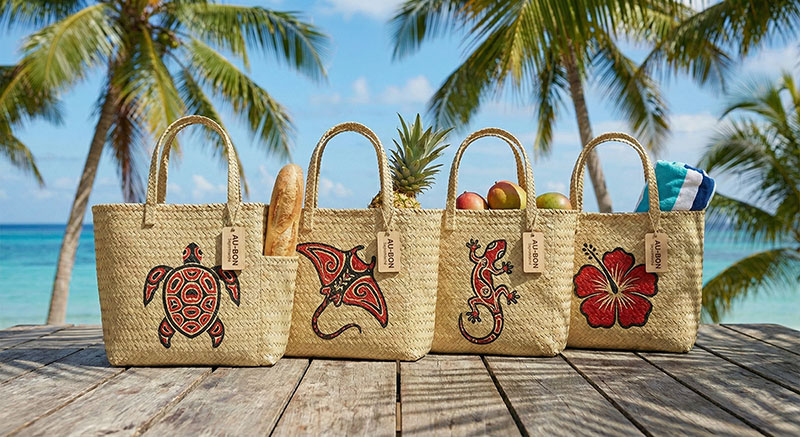
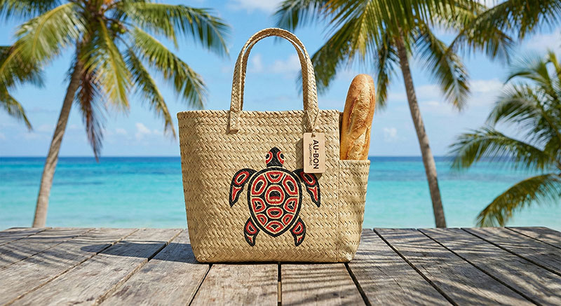
We are not designing a grocery bag; we are crafting a piece of carryable culture.
Organic Materiality Concept: Moving beyond generic canvas. We utilized locally woven Pandanus leaves to solve tropical climate challenges (humidity/mold) while honoring Vanuatu’s weaving traditions.
Primitive Totemic Art Concept: Replacing digital prints with "Hand-Painted" aesthetics. Earth-tone totems (turtles, geckos) applied with raw strokes transform a mass commodity into a unique artifact.
Cultural Hybridity Concept: A fusion of lifestyles. We seamlessly integrated functional details like the Baguette Pocket into the Melanesian basket structure, bridging local craft with the island's French heritage.
THE STUDIO VANNA EDGE "At STUDIO VANNA, we turn a daily necessity into a cultural souvenir."
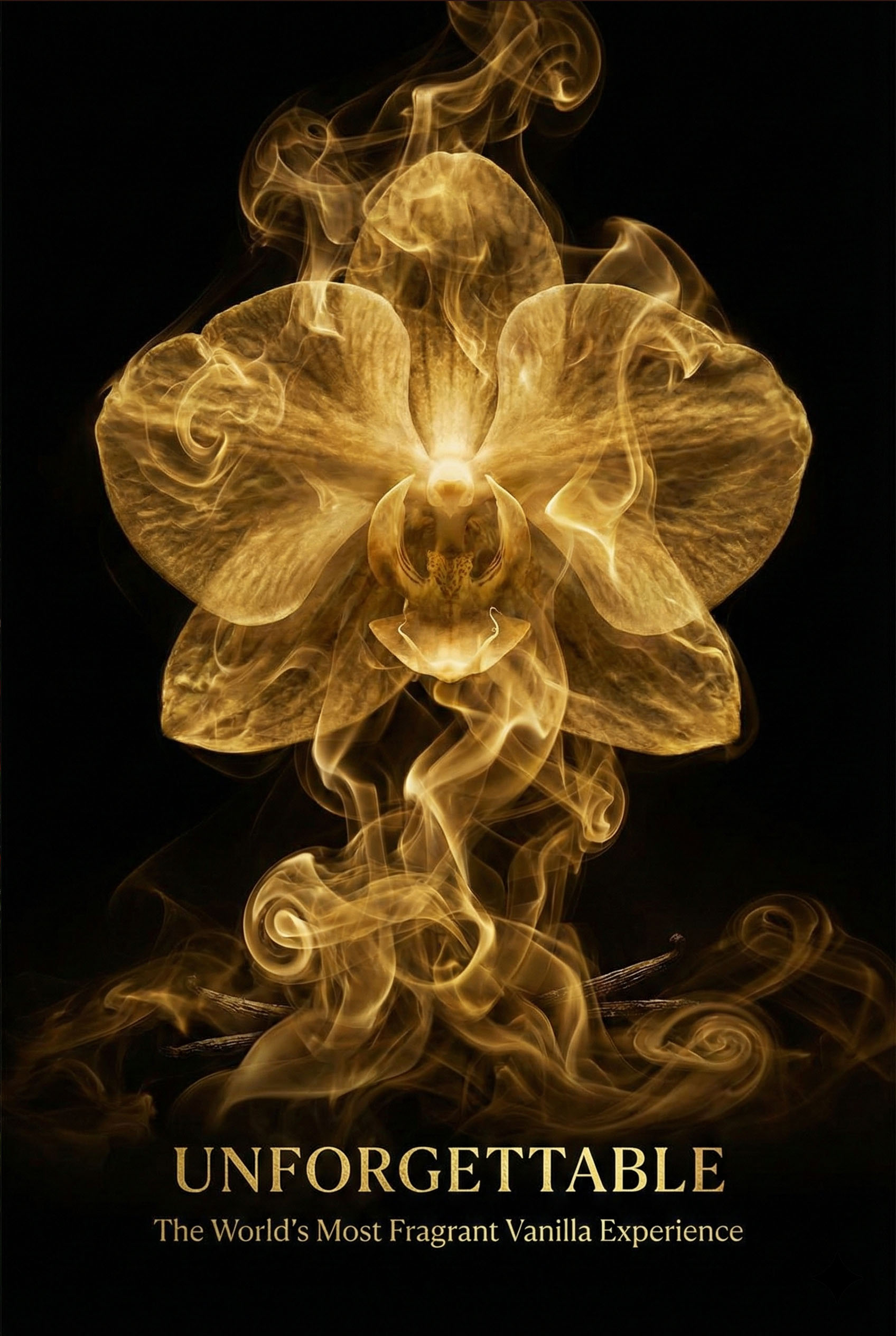
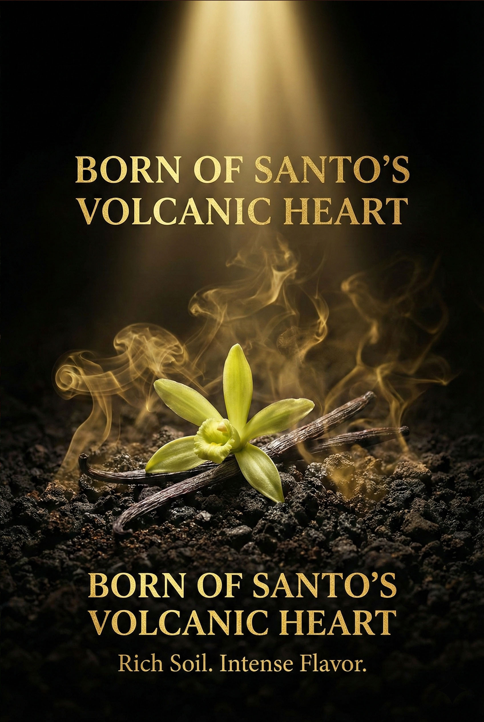
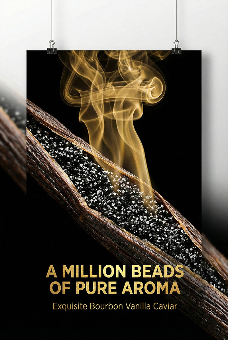
We are not selling a baking ingredient; we are capturing the breath of the rainforest.
Organic Elegance Concept: The "Dance of the Vines." We utilized fluid S-curve compositions to guide the eye, mimicking the natural growth rhythm of vanilla orchids. It’s not just a plant; it’s visual poetry.
Synesthetic Design Concept: Bridging sight and scent. By contrasting the Creamy White (flowers) with Glossy Black (cured pods), we trigger the olfactory memory through color, making the viewer "smell" the fragrance through the screen.
Atmospheric Softness Concept: The "Morning Light" filter. Unlike the high contrast of the Volcano series, here we used soft, diffused lighting to evoke freshness, purity, and the gentle climate of Santo Island.
THE STUDIO VANNA EDGE "At STUDIO VANNA, we visualize the invisible art of fragrance."
A destination is never just one thing. We created three distinct visual dialects to speak to three specific traveler personas.
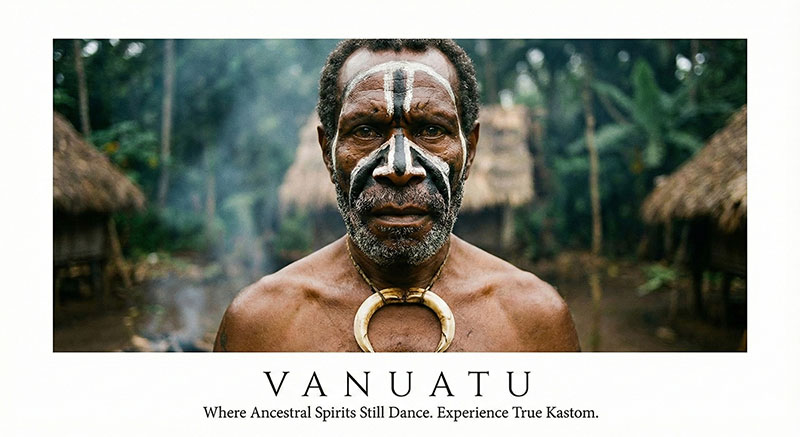
The Cultural Portrait (Realism Style) Image: Ancestral Spirits (Portrait of Ni-Vanuatu man) Target: The Cultural Anthropologist The Soulful Gaze Concept: We moved beyond scenic postcards to capture the human soul. High-fidelity photography focuses on the intensity of the "Kastom" face paint and the eyes, establishing an immediate, raw emotional connection. Message: "Experience True Kastom." It’s not a show; it’s an encounter.
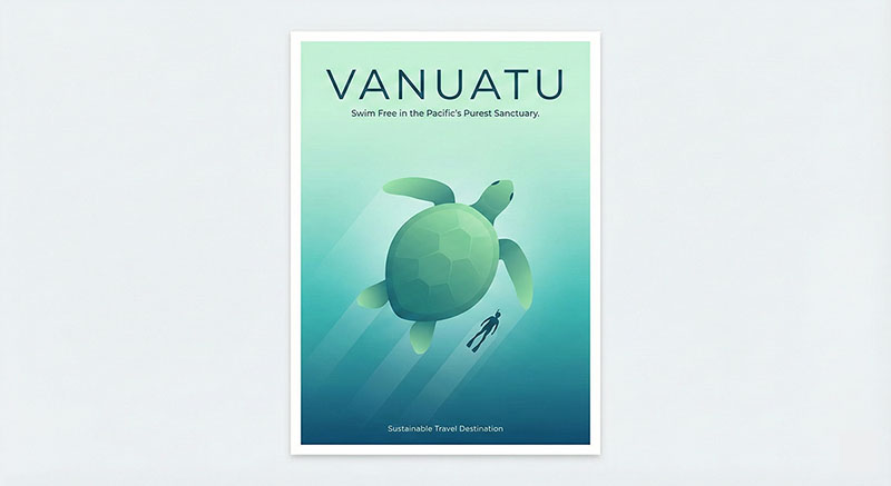
The Eco-Minimalism (Flat Vector Style)
Image: Pacific's Purest Sanctuary (Turtle & Diver)
Target: The Eco-Conscious Traveler
Visual Silence Concept: Less is more. We used clean gradients of turquoise and emerald to visualize the concept of "purity." The minimalist vector art strips away the noise, promising a serene, unpolluted sanctuary.
Harmony: The interaction between the diver and the turtle symbolizes coexistence, not conquest.